Pickleball Court Colors That Improve Ball Visibility
Pickleball court colors that improve ball visibility can make the difference between clean rallies and missed shots. Losing a point to the sun’s glare is a frustration every player knows. But the solution isn’t just to “watch the ball closer” — it’s engineered directly into the court’s color. The issue isn’t your eyesight; it’s a simple mismatch between the ball and its background.
The specific blues and greens on pro courts aren’t for aesthetics; they’re chosen for maximum contrast. This visual principle helps your eyes track a fast-moving ball so you can play better — just like choosing the right surface during pickleball court construction to optimize performance.
The right court colors are a simple fix for better gameplay. This guide explains why some shades make the ball ‘pop’ while others cause it to disappear, helping you play on courts designed for clearer sightlines, faster reactions, and more confident calls.
Why the Ball Itself Is Your First Clue
Before considering court paint, the first clue to great visibility is the ball itself. Ever wondered why pickleballs are almost always that specific, glowing shade of yellow or orange? It’s not a random choice; it’s a design decision rooted in how your eyes work.
Our vision is naturally fine-tuned to spot bright, warm colors like yellow and orange, especially when they’re moving. This is the same reason you see high-visibility safety vests in these exact hues—they are scientifically proven to grab our attention faster than any other color. This makes the standard pickleball color ideal for tracking a fast-moving object.
The ball is intentionally designed to be the “hero” of your visual experience. The court’s job, then, is simple: use pickleball court colors that improve ball visibility to make that hero stand out.
The Single Most Important Rule: Create High Contrast
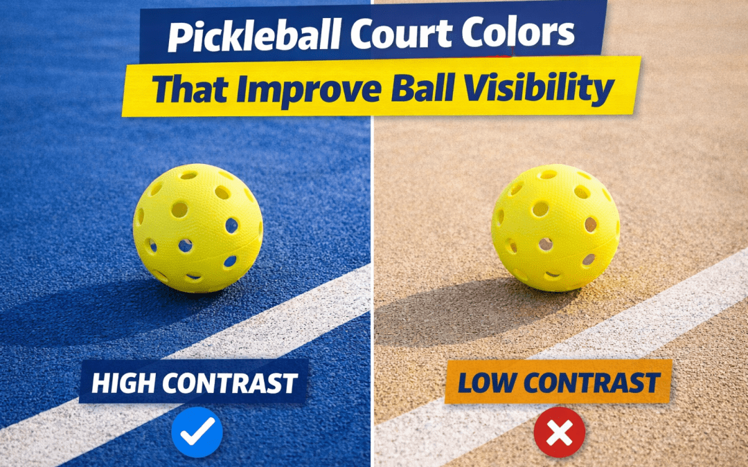
With the bright yellow ball as our hero, the court surface has one crucial job: making that hero pop. The single most important rule for ball visibility is creating high contrast. Think of it like black text on a white screen—the sharp difference makes it effortless to read. You want that same instant clarity between the ball and the court.
The easiest way to achieve this is by pairing colors that are opposites. For a bright yellow pickleball, a deep blue or green court creates the strongest visual separation. A yellow ball against a vibrant blue background seems to leap out, making it far easier to track during a fast rally. This simple pairing is the foundation of high-contrast court surfaces.
Low contrast—like a yellow ball on a light tan court—forces your brain to work harder, leading to slower reactions, questionable line calls, and eye strain. This principle directly explains how pickleball court colors affect ball visibility. It’s about performance, not just aesthetics. The classic blue and green court combination is a deliberate choice to improve the game, not just a trend — a key consideration when investing in pickleball court painting services to enhance player experience and contrast.

Why Pro Courts are Blue and Green
With high contrast as the goal, blue and green are the top performers. These cooler, deeper tones make a bright yellow ball appear sharper and easier to track, which is why they are the standard in professional and tournament settings.
This choice is supported by the official USAPA court color recommendations, which favor these hues for consistent, fair tournament conditions. An endorsement from the sport’s top organization signals that the choice is rooted in performance.
Beyond making the ball pop, these colors offer another crucial advantage for outdoor courts: they reduce glare. Lighter-colored surfaces reflect more sunlight, creating a blinding effect. Because medium-to-dark blues and greens absorb more light, they create a more comfortable playing environment. This makes them the best color for outdoor pickleball courts, helping you see clearly even on the sunniest days.
The Pro-Tip for Perfect Color: Using a “Brightness Score” (LRV)
Knowing that blue or green is a great choice is one thing, but how do you pick the right shade? Court designers use a simple tool called Light Reflectance Value, or LRV. Think of it as a brightness score from 0 (pure black) to 100 (pure white). When figuring out how to choose pickleball court paint, this number is your secret weapon for perfect contrast.
A bright yellow pickleball has a very high LRV. To make it pop, you need a court with a much lower LRV—ideally in the 30-45 range. This creates a significant ‘brightness gap’ that makes the ball easy to see while also reducing sun glare on a pickleball court. A court that’s too dark (very low LRV) can get hot and make it hard to see in the shade, so this medium-dark range is the sweet spot.
This measured contrast approach is especially helpful for older players and people with vision sensitivity, who benefit from higher contrast to track moving objects clearly. A court with optimized LRV reduces eye strain and improves reaction time for everyone — a smart design choice when planning two-tone pickleball court color schemes.
Two-Tone Courts: Does the Kitchen Color Really Matter?
Have you ever hesitated on a shot, unsure if your feet were behind the kitchen line? This is precisely why a different-colored non-volley zone is one of the smartest custom pickleball court design ideas. That visual border gives your brain a quick, clear signal of where the kitchen begins, making split-second line calls much easier.
Beyond just defining the zone, this color shift plays a clever trick on your eyes to improve depth perception. When the court changes from a darker to a lighter shade, it creates an immediate sense of distance, helping you subconsciously judge your position relative to the net. This allows you to better gauge your movement for a dink or judge whether you have space to let a serve bounce.
The most effective of the best pickleball court color combinations uses a darker, low-LRV color like deep blue for the main court, with a lighter shade for the kitchen. This two-tone approach enhances spatial awareness for both outdoor and indoor courts, a principle often deployed in sport surface design to improve visibility.
Your Checklist for a High-Visibility Pickleball Court
Pickleball court colors influence every rally. Use this checklist to optimize visibility:
- Start with the Ball: Choose a bright yellow or orange pickleball.
- Pick a High-Contrast Court: Pair it with a medium blue or green playing surface.
- Use Crisp White Lines: Ensure all lines are bright white for undisputed calls.
With the right colors, courts stop working against players and start working for them. Whether designing new courts or resurfacing old ones, color choice becomes a performance upgrade — not just a design detail.